Everything which is not recognizably a circular fox-thing is something else.
Hypothesis: marketing people are afraid to continue a brand identity that can go on for decades, because that kind of success means that they don't have a redesign project every three years.
AT&T has been a variation on the Death Star since 1984.
IBM has been horizontally striped initials since 1972.
I very much agree. Marketing people will always want to design fresh things because that's what they love to do. Once their product dies, they move on to something else.
Marketing people also believe that you can sell anything with a fresh coat of paint. They are trained to sell.
I think the new icons are awful. You don't even see it's Firefox anymore. God I dislike marketing people so much. :(
The new icons aren’t intended for Firefox itself; they’re intended for projects like Quantum, or developer tools, or other parts of the FF ecosystem that should look “Firefox-y.”
What happend is that web design got more professional compared to times when FF started out as a brand, and they want to appeal to web designers (and graphic designers entering the field) and the overall design community, which has a bias towards modern minimal designs, where Firefox doesn't really fit in.
Their Mozilla rebrand was fresh. It could be a good idea to start a new brand, and develop the name and shapes together, without the limitations of the existing Firefox brand. With all the design talent surrounding them, they could come up with something stunning.
If they don't have anything to design they are fired and have to go find another job. So they actively look for things to design and propose changes.
Remember the moz://a brand change? I wonder if there is any way to measure the benefits of it, except for the paychecks to the designers.
Edit: I realized that it could be another thing. They are signalling they are alive and well. Similar to buying a 200k sport car. See how much money I can afford to do without?
Changing a famous logo is almost always a bad idea. The reputation of a brand is inextricably tied to the logo, for some reason in the buyer's mind. If you change it, the feelings have to start from scratch.
It doesn't matter if the font is outdated. Think if Coca-Cola changed its logo, or the New York Times, or Pininfarina. Okay, that last one was for me. I don't expect most people to know Pininfarina.
Please tell me this is a joke and not just the golden number's version of an Onion article. Actually - you don't even need to. I've seen marketing material that's very similar to this kind of psuedointellectual garbage.
This is in "so bad it is good" territory - sharing it with my design team tomorrow morning.
At the time this was released, I worked at a marketing agency (not Arnell, but in the same family) that was Pepsi's Agency of Record for a number of businesses.
When we got a copy of this proposal, we thought that either Arnell had lost his mind, the entire agency was poisoned with a noxious gas, or it was a joke.
Funny, I like Pepsi, but it confused me when they changed the logo. (I guess because I don't watch TV.) At first I probably thought it was some cheap knock-off.
They have an opportunity to being a bunch of really cute animals if they want a suite of logos. A big part of why I was attracted to Firefox when I was young is I had a brand association in my mind “it a fiery-fox, the fastest browser on the planet” (I guess until chrome came along). With quantum it feels fast and lightweight again.
Same with thunderbird mail client. I iconic logo and a brand that would make an imprint.
I guess I always had a thing for animals. That’s what Ubuntu was my favorite distro. The names - Breezy Badger, Warty Warthog e.t.c
Animals evoke an emotion, they represent something.
Fascinating that you describe the logo as a fox chasing its tail. I’ve always thought of it as a fox snuggling up around a blue sphere (which I always interpreted as Earth or a globe).
We are in a design bubble (we have been for a few years now). There are way more designers than there is meaningful design work to do, and they need to justify their existence and paycheck. Hence all your favorite companies doing complete, yet more often than not misguided, redesigns every other year.
Donations to Mozilla don't (probably can't, legally) go to Firefox development. Mozilla Foundation is a charity, Mozilla Corporation is a for-profit enterprise. Money can flow from the Corp to the Foundation but not in reverse.
So if you give money to the Foundation, the Corporation has to give less to the Foundation to keep it funded. You could as well have given money directly to the Corporation.
Some bad managers outright encourage unnecessary redesigns. It's a lot easier and often cheaper to change the product's skin than lead a dysfunctional dev team through fixing crippling tech debt or adding meaningful new features.
I have a theory that we're almost always in a design bubble.
Look back in the history of most major brands, icons and trademarks and the ones that most people would consider classic all seem to come from two or three distinct eras.
The rest can be viewed as "what the hell were they thinking/smoking?", cargo culting the current fashion and much jumping on bandwagons.
Looking at tech, designers have held very little power historically. Examples are few and far between, with Apple being the most notable outlier. Old Apple did not change the status quo much - it was a golden child for less than a decade after all - the 80s and 90s saw very little tech companies where designers were calling the shots. Only when New Apple rose from the ashes did tech start to deeply prioritize value design. Nowadays, many startups have design cofounders, major companies like Airbnb or Dropbox regularly and prominently show the influence of their design teams, and so on.
It definitely feels like an overcorrection right now - many designers will surely be amongst the first to go in the next recession.
(As far as fields other than tech, they’re all completely different stories regarding their relationship to visual design)
Well as long as it has a fox and some form of firey colors, going around the globe , it’s easy to know that it’s firefox.
But I also know after working with a number of designers, that doing re-branding of a major company is kind of a hallmark event in their careers, and this is the reason we have an evolution of brands.
I do hope they stick to the silhouette though. Apple is still very recognizable after a number of logo changes. It’s still an Apple.
Changing a good and established logo to an even better, universally loved logo would be great.
So far I don't see anything which is better that the current logo, though. Those might be fine logos for other projects, but none of the variants offered does a better job of saying "Firefox the browser" than what we have now.
Well, please keep iterating; finding a great logo takes creating a huge lot of variants that don't make it, and a lot of time.
I've noticed that Pepsi has gone from the asymmetrical smiley face back to the original logo on some products. Changing the logo probably just causes confusion when the identification process is almost subconscious.
I definitely agree with not changing recognizable brands, but I wonder how much the fact that those companies have their logo printed on products, lots of stationary, buildings, etc. influenced their decision.
Compared to let's say IBM-who has their logo printed on millions of computers-Firefox being a digital product might make it easier to change the logo.
Originally it was a bird; Firebird. But as there already existed a software product with that name, after some time it was changed. Probably fox was the next best animal to go with fire.
As others have noted, it’s more of a fox wrapped around a globe — the icon made at a time when the competition (IE) had a circular icon which was an “e” with a ring around it.
I mean, they gave a justification: they wanted to create a design system so that their different offerings, like Firefox Focus and apparently other things, can have their own consistent icons. Also, I don't see anyone suggesting it shouldn't resemble a fox. The new icons don't look hugely difficult to recognize and it's mostly an incremental change imo
But what you are missing is, before 1984, AT&T's logo was different. They re-did their branding in 1984. So what's to say that this isn't Mozilla's opportunity to rebrand Firefox?
Also, Firefox's logo was a Phoenix from 2002 - 2004, did you know that?
At this point, Mozilla's biggest asset is the Firefox brand. Seems unwise to go with a bland, generic redesign... especially one that's a blatant rip off of GitLab.
It also seems like they're going to have two "main logos"? And incredibly different logos for each flavor of Firefox? I used to work at Mozilla, and it was already confusing enough to explain Mozilla vs Firefox to the average person.
Their current userbase is mostly less-tech-savvy people, and I can't imagine changing the icon is going to go well for Firefox. Much like how it took Firefox a decade to convince people "The Internet" wasn't just IE's "e" logo that came preinstalled, changing their icon is going to hurt way more than it helps.
>Their current userbase is mostly less-tech-savvy people
Really? I thought it was the complete opposite, as it's the free software browser (chromium/chrome aren't really free in spirit because they are too closely related to Google), and the standard browser on Linux.
Firefox is used by people that had it installed by friends/family/techsupport in place of IE. With exception where Google has managed to scam Chrome on them.
Those people got switched to chrome in the meantime (most of these 2000 era computers are long dead now). Actually replacing these machines with Chromebboks is a often heard advice now.
Since a year or two Firefox was actually good while Chrome stagnated, and use cases for multiple browsers also flourished (ex: keeping a “facebook browser”, or splitting google accounts between browsers). I’d expect heavy computer users to be more sensible to these merits.
Weather or not it is true Mozilla only cares about the less-tech-savvy userbase now. Just look at what they've done with Firefox instead of what they say.
This is total FUD. What about developer edition? WebIDE? The grid tool works great, the network tab has been better than chrome’s for at least as long as I can remember; and unlike Chrome, I don’t have to sideload add-ons that challenge Google’s business model (AdNauseam for instance). You’ve said a lot in your comments but it’s hard to figure out what specifically you’re referring to in any complaint.
Yes! That's half of it. They've made it really fast for running JS web apps and safe for people who don't know not to do dangerous things.
The other have is removing functionality like the user customization of XUL and jetpack style extensions (killing off a giant ecosystem that has yet to recover). And there's also the anti-freedom (pro-security) changes like the removal of the ability to install (or modify) your own extensions without Mozilla's approval and signing. And no, using a beta (developer/etc) manually installed does not count.
Extensions are still limited in countless little ways many months after the Quantum release. Every one of them makes the browser a bit worse than it was before. The claims about making extensions safer and more reliable have proven to be optimistic, with a string of problems around both instability and privacy since the big change.
More generally, I come across sites that don't work properly with Firefox several times a week these days. Chrome is the new "This site displays best at 800x600 in Netscape Navigator" and Firefox's market share has fallen so low that a lot of web developers simply don't test with it properly any more. Maybe this isn't Mozilla's fault, but realistically it is still their problem.
As for speed, while some people seem to find Quantum a big improvement in speed, it hasn't made Firefox noticeably faster than other major browsers for most day-to-day use.
I want to like Firefox. It was my primary browser for years, thanks to a combination of flexibility through add-ons, being relatively good for privacy and security, and having relatively good developer tools (all of these being somewhat related). But as someone who uses all the major browsers professionally, I can only assume that the leadership at Mozilla have chosen a strategy of trying to out-Chrome Chrome, and that is going about as well as anyone more objective might expect while still giving up almost everything that was a natural strength for Firefox before.
I actually really like the "masterband" fox icon they have, but as you pointed out, it's almost exactly the GitLab logo. Granted, I like the Mozilla version better here. I think the added angles underneath make it more appealing.
Maybe GitLab should just borrow the idea before Mozilla finalizes it... I mean, not really, but it would be pretty great if they did.
I'd never seen that one before. It looks like GitLab made a minimalist version of MetaMask's logo, and then Firefox made a "modern" version of that. Obviously that's not what happened. I assume.
“Red pandas were once thought to be closely related to the giant panda, but genetics has shown they are more closely allied with the raccoon and weasel families. They are secretive and gentle creatures, spending most of the day sleeping curled up with their tail wrapped around their head.”
Firefox is not a type of Panda. The Red Panda (AKA Firefox) is an animal in a family of its own (not fox or cat or raccoon). The Panda is a bear.
The Firefox logo depicts a fox not the Red Panda (but everyone knows that). The project was supposed to be called Firebird, but another open source project had already taken up that name.
Google blasts its chrome ads on the most visited site on the planet purporting to be very fast. Firefox happens to be a default browser for many linux distributions. Which one do you think attracts the less tech savvy people?
But solely being a web browser targeted to tech-savvy people is also a sure way to die. The modern browser engine is simply too complex to exist without enomorous user base and Firefox user population is arguably around the threshold.
Most people see that Google does other things besides Chrome (the search engine, youtube, android, etc.), and that Microsoft does other things besides Edge/IE (Windows, come on). Ask anybody what Mozilla does besides Firefox. Most people have no idea.
Mozilla is an organisation that creates the browser Firefox. However, it used to create the Mozilla Suite [1], a set of applications that included e.g. a browser and an email client, which evolved into Firefox and Thunderbird respectively. SeaMonkey is somewhat of a successor to the Mozilla Suite [2].
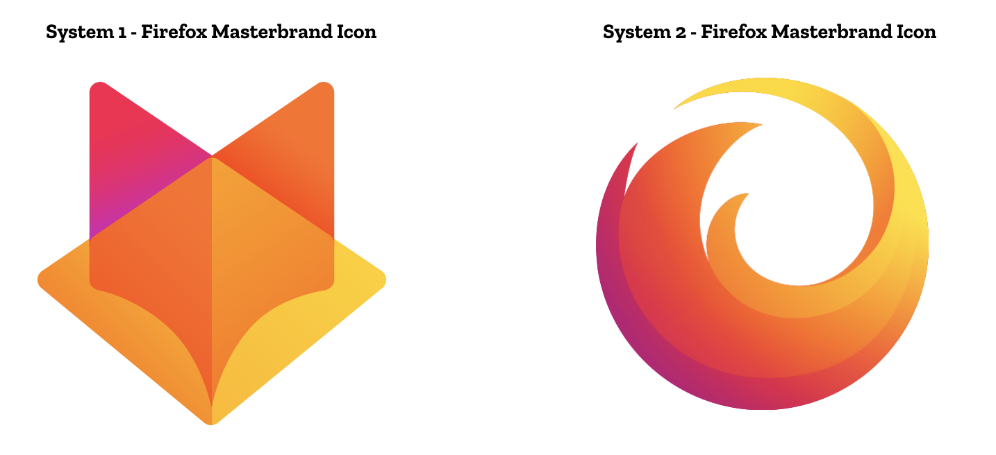
Yeah, as soon as I saw the System 1 Masterbrand I thought "GitLab"; probably not the reaction they're going for. These seem incredibly uninspired and unoriginal to me overall.
I think the comparison with [2] is tenuous, but it does touch on some interesting history. The Mozilla browser logo used to be an actual Phoenix (https://www.logaster.com/blog/firefox-logo/) until they got done for trademark infringement. Though it was a company, not a state that sued them. If anything it's more like the Thunderbird logo, upside down.
However if we're going to shout plagiarisim, the Phoenix logo is strikingly familiar to the (Rebel) Alliance Starbird which predates it by about 20 years. Given that it was chosen by popular vote, is that surprising? There's also Vauxhall Motors which has a griffin, but looks somewhat similar.
OH, so that's why that icon felt so familiar. I thought it had already been made public long ago since I feel like I've known that icon forever... nope, Gitlab's.
I don't know if I agree on [1], because the GitLab icon draws the eye horizontally, while the System 1 proposal is vertically oriented.
That it (intentionally) looks like an open book or magazine also distinguishes it. I think the dual image illusion (magazine/fox) is clever and it works close up and scaled down.
I think the system 1 icon is too similar to gitlab which is a shame since I like that one the best. I would like it as the default browser icon instead of a round icon.
Note that under both proposed systems, the icon of Firefox-the-browser would remain the same. The "Gitlab-like" vulpine logo would be that of Mozilla, whose logo is the "://" thing right now.
That "://" logo would be one year old. [1] And yeah, it does look stale already.
I appreciate thoughtful design, but IMO the frequency of redesigns of Mozilla branding/subbranding/websites/subdomains only communicates a sense of vanity at this point. The visual schizophrenia between trustworthy software developer and NGO doesn't help.
I think I might be the only person in the world that actually likes the moz://a logo..
But like most people say here, I am not a fan of the new system logos, but the system 2 browser logos are cool.
Mozilla's logo isn't changing. They want to add a new logo for Firefox, as a brand family. So the Fox-head logo would be used to identify the Firefox family of products, which they're saying they are going to grow.
You end up with a hierarchy like:
Mozilla -> Firefox -> Firefox Quantum/Focus/<insert new product here>
What's "not really a logo" about it? Is it because it's only a stylized version of the name? In this case, Coca-Cola probably doesn't have a logo either: https://en.m.wikipedia.org/wiki/Wordmark
Honestly, what makes a brand identity work is at least 50% longevity. One good logo is better than 3 great ones over the course of a decade. If there's no continuity, not only do consumers have to become reacquainted with the brand (losing some established good will), you don't have any brand recognizablity until it becomes well known again.
The Firefox globe is a good logo. Not only is it instantly recognizable, there's a clear connection between the symbolism in the image and "Firefox". I think the globe logo is also suggestive of international connectedness and cooperation - Firefox is something that brings people together.
IMO all the suggested icons represent a change for the worse. Even the one from System 1 most similar to the existing logo reduces the amount of detail and makes it harder to quickly recognize the logo at a glance.
And it's worth adding that both of these proposed design options are great work in isolation; separate from any existing market concerns, these would make for great logo systems.
But the biggest problem for any redesign is that the current Firefox globe is just so damn good. It has been refined numerous times over the past decade but iconographically—when viewed at a small size for short bursts of time—it has barely changed since the original in 2003. Each refinement has simplified the design to a point where further simplification is simply not justifiable for reasons of aesthetics or utility.
Look at the progressive simplification of the QANTAS flying kangaroo logo over the years. [0] The third-most recent logo is utterly iconic and timeless. The second-most recent iteration teetered on the edge of a cliff of oversimplification and gave the kangaroo clown feet. The current logo? The only reason that it isn't an obvious trainwreck, the only reason isn't immediately obvious that they've fallen off the cliff is because it evokes memories of the older logos when the kangaroo actually looked like a kangaroo. They've doubled down on the clown feet and given it a gradient that makes zero sense. The overall shape is so abstract that it might as well be a boomerang-like throwing or slicing implement. But it does look super modern.
The older I get, the more I hate the industry around "brand". Obviously it has an effect, I get that, but my god the branding guys are so wanky about it. They can go on for hours about stuff that literally no-one but branding guys care about, and unlike techies they don't seem to have learnt how to summarise and then shut up (because non-branding people, like non-techies, really don't care). I don't remember it being this bad a decade ago, but I was only starting out in the tech industry then so perhaps I just didn't see it.
Maybe it's a bit harsh to lump this blog post in with the stuff I'm complaining about, but it doesn't help having daft phrases like "Do these systems reinforce the speed, safety, reliability, wit, and innovation that Firefox stands for?" (answer: no, they're small images).
I've reached a point where I just abhor marketing in general, and branding is swiftly joining it on the pile at this rate. It was in hindsight a good idea to go back to programming after getting my design degree!
> unlike techies they don't seem to have learnt how to summarise and then shut up
Have you seen a post on here about text editors, tabs v spaces or rust vs C++? Or how about the weekly posts of "we rewrote our CRUD app from FOTM X to FOTM Y and this is why it's awesome" ?
Well to be fair this is really the target market for those sorts of posts and discussions. Equally the same could be said of the Firefox blog post I guess, that it was intended only for other branding people, and that by posting it here it is outside of the interests of many people here (though as it was addressed to the community I don't believe that to be the case). However when branding guys write these sorts of posts, they very often write it as if they're preaching to the unwashed masses.
Clearly everything that was before is now terrible, our new icons resemble the very essence of our business/existence/the human condition, and we will deign to allow you to experience it. Bonus points if they fit "growing the brand" in there somewhere!
Haha, that might have been a bit of a generalisation. Unless the person is socially inept (which, to be fair, isn't uncommon in this industry), I think you eventually realise that nobody is interested in what you are interested in. I just talk about my other interests now, unless I want someone to go away.
Though that in itself is a useful skill at parties:
Scenario 1: Talk about computers, person gets bored and goes away. Success! You avoided having to talk to people.
Scenario 2: Talk about computers, person is really excited to talk about computers. Success! You found a fellow dork.
"Say “Firefox” and most people think of a web browser on their laptop or phone, period.... from easy screen-shotting and file sharing to innovative ways to access the internet using voice and virtual reality, these tools will help people be more efficient, safer, and in control of their time online."
Translation: They want to overload the Firefox name to the point where it's totally meaningless. The success of the Firefox name is no doubt the reason but this fails to recognize that's not how names work. This direction is exactly the reason why Nintendo called their console "WiiU" and that turned out about as well as this ultimately will.
There is absolutely nothing wrong with Firefox being the name of a single product. The entire underlying premise of this redesign is flawed.
"Firefox is where purpose meets performance."
The marketing direction here could not be less inspiring.
Exactly. This looks like yet another attempt to detach Firefox the Brand from Firefox the Web Browser.
Mozilla has tried this a number of times already, and they fail spectacularly every time. I wish they'd just own the fact that they're making a web browser, and focus on making it the best web browser in the world. Not some generic platform.
Purpose meets performance? WTF? It's so generic, it could be the tagline for any automobile, sportswear, or study aid.
I'd say neither are very good, and they lack the sophistication of brand design history and why things are designed the way they are. I can tell these were sketched and created by someone who has not studied iconography or identity branding.
But why is this the case? What indicators signify this? Here's a basic test: damage them.
Strip away the colors. Make them entirely flat. Can you still identify them? Do they stand out after you've "damaged" the icon in any regard? It's just not colorblindness: what about to a viewer who sees them as slightly blurred, can you still recognize the brand? If you warp the logo, as if from a wrinkled shirt, can you point out whose brand it is?
What about on the worn surface of a sticker on someone's MacBook? Someone getting acetone on some branding materials?
Think about the branding of companies from the S&P500, when the light hits cutouts of their icons, can you identify them from the shadows?
I can’t figure why companies and foundations waste money and designers time to make new ugly logos when their current one are totally ok and well recognized. This is even more ridiculous since Mozilla recently changed its logo for black and white that is at the total opposite of what is shown in the blog post.
In addition to the fact that they'll all look old in three years: none of these icons really leverage each other. If you saw the rocket ship and the picture and the browser next to each other, nothing about them but the color scheme would connect them.
Firefox survives in spite of mismanagement and misapplication of resources from the top down. For example, do they really need a lush waterfront office in San Francisco?
The fox chasing its tail is an iconic brand, and also an iconic color scheme.
I like the other icons that carry forward the Firefox color scheme to other shapes (system 1, row 2), that still feels firefox-y without being Firefox, and would be a good look for firefox affiliated products. When you get down to the third row of system one, or the "master brand" icon, it loses both the recognizable shape and the recognizable color scheme of the Firefox brand.
System #2 is just a mess. I don't even know what they're going for there.
These logos looks really fresh right now, but I doubt they'll age gracefully. The viridis/magma tones with gradients are a dead giveaway that a logo was designed between 2015-present, and I suspect they'll look old-timey in a few years. The current moz://a branding will likely age better.
I just knew this was going to be bad based on the title of the article alone... No need to change the current logo and even worse to consider something so close to the Gitlab logo. Mozilla should be embarrassed.
Now, organizations do change over time, as the people behind them change. But I honestly cannot believe such a retarded move can be justified by the ignorance of management and design. How can such a decision not be turned down immediately? Erasing the iconic Firefox logo? The only brand asset they have?
Is the Mozilla organization infiltrated by saboteurs? I imagine a lot of governments and corporations will be much happier when the last trully free browser dies. Please fire those people.
With the post about golang branding this is the second time in the space of a few months that I read a branding post that sounds like a parody.
Look at the images at the bottom. Look at that hip guy wearing D&G sunglasses and a hip, obviously photoshopped, firefox t-shirt. What is that? Is moz://a making a web browser or a new fashion line? Did Mugatu make this post?
I liked it better when corporations kept their masterbranding habits private.
How many version of Firefox do they intend to ship? I don't get it... If they are declination of Firefox, surely they should keep the fox in the picture no?
While evolving the brand, could you also add a dark/night mode to your browser? Dictionary lookup would be good, too. There are no extensions satisfying my requirements. Besides, I try to minimize the use of potentially insecure and privacy-violating code.
Although I like both icon sets, I really miss the colors of the current Firefox logos. It seems that the new Firefox logos in these two new sets use slightly different colors. I believe the current colors are much nicer with great contrast, even though it's a small difference.
Which is an unnecessary change and an icon which looks nothing like the other icons so still does nothing to offer "enough design tools to represent this entire product family."
I don't exactly dislike the new browser logo (although I think going less circular is dumb) so much as I think it's unnecessary.
My bigger issue is that the other 9 logos don't use the same design motif beyond the colors.
The browser logo is a "fox" encircling the globe leaving a trail of fire, or speed. This is perfectly fine for a global communications tool named firefox that thinks "purpose meets performance" is it's brand identity.
but if you want to use the same design tools for the same brand identity: you need to focus on things that imply performance which none of them do except maybe a rocket. and you need them to evoke each other which, imagine for a second those were all random colored and on your phone's home screen; what about them is thematically unifying?
Both of these options are godawful, but that's the amateurishness I expected from whatever design team came up with the horrendously terrible MDN redesign last year.
Maybe it's those sunglasses and that pose, but their new mascot in the douchey dot com white dude costume sure nailed the "Chad" stereotype! Right out of central casting, as Trump would say. Which episodes of Silicon Valley did he play a Hoolie Brogrammer? ;)
Everything which is not recognizably a circular fox-thing is something else.
Hypothesis: marketing people are afraid to continue a brand identity that can go on for decades, because that kind of success means that they don't have a redesign project every three years.
AT&T has been a variation on the Death Star since 1984.
IBM has been horizontally striped initials since 1972.
NBC is a peacock.
McDonald's is golden arches.
Firefox should be a flaming fox chasing its tail.