It's an interesting visualization, but it doesn't really seem to highlight anything new about the way prime numbers are structured. It's difficult to make connections between the spiral and the prime numbers, because the red pieces don't generally stand out strongly against the white pieces (at least not in any obvious pattern. There are cool things you can notice if you think about it long enough, but you notice these things without the help from the spiral too).
I disagree with that. The entire point of data visualization is to highlight patterns in data to make the data easier to understand. Highlighting what's already known is a waste of time. A good visualization will help uncover something new.
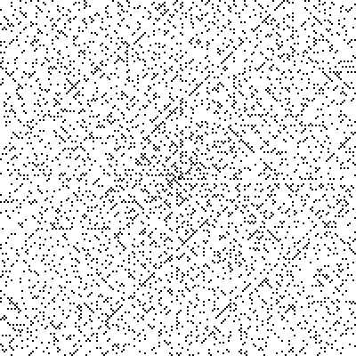
I feel bad saying this, because it probably took a lot of work to make, but this prime number spiral is kind of pointless. What is it showing me? If I let the painfully slow animation run for a while, and look at the bigger picture, what insight will I gain about prime numbers? Probably nothing.
It's even a bit misleading, because to the best of my knowledge, there's no connection between spirals and prime numbers.
If I'm just being dense and not getting it, I'd love for somebody to explain it to me.
"there's no connection between spirals and prime numbers"
You just shot yourself in the foot :(
Yes, there is a connection. If you add up the total distance each line makes in a tick, its equivalent to the harmonic series, which is a special case of the zeta function. This is where the spiral comes from. Its a dirct consequence of the fact that each number has period 1/n. The spiral emerges naturally, its not programmed or forced into that shape.
A number of very elementary things. It gives a very intuitive visualization of twin primes, as they lie before and after highly composite numbers (which are also easily visualized), as well as a visual explanation for why the prime gaps tend to increase, as larger numbers are likely to collide with a factor. You can also use it to explain prime factors, least common multiples up to N (when the first N lines come into alignment), and the cyclical nature of factors in general. This is a creative pedagogical tool, not a breakthrough in number theory.
It's a very beautiful visualization. I particularly enjoy seeing the period of each block correspond with the representative number. If only there were more visualizations like this for other mathematical concepts!
I found this to be a great visual. I stared at it for quiet some time looking for the patterns. I thought it would be cool to put some music to it... https://www.youtube.com/watch?v=hnHhRtHmiCc
Edit: I will go back and fine tune the video so it syncs to the music.