Author here. Went to bed early with a nasty cold last night and woke up this morning to all these lovely comments - thank you for all the great feedback.
Very nice Tim - I love the way you smear out the data.
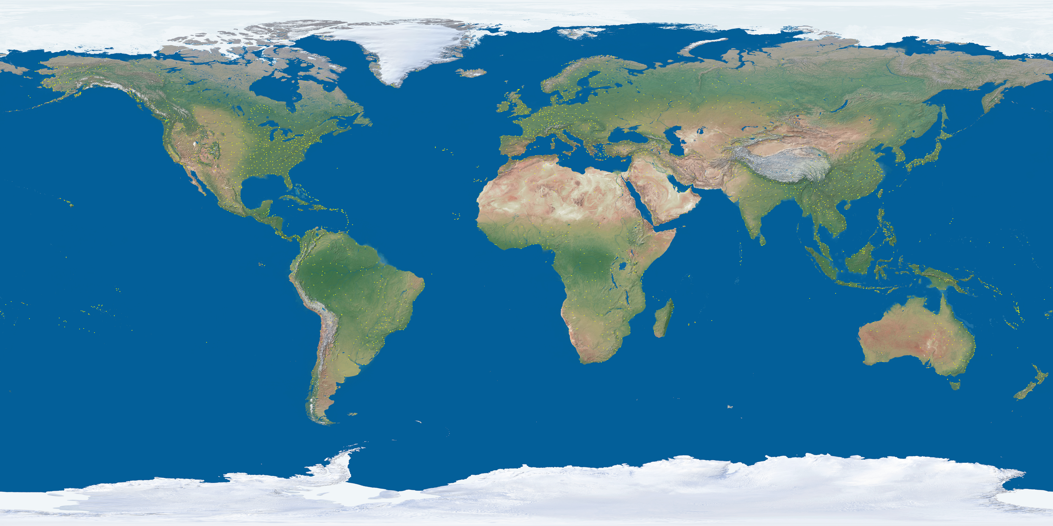
I found plotting the data over Europe and the US to be a difficult visualization problem - there is just so much data in a small space. Perhaps changing the size of each point depending on your distance would work?
Wow, a mindblowing visualization which presents the reality to the minds of people like me who often imagine the world is flat like on the map and connect places by straight lines
I have a minor complaint. When I zoom in, the rate at which the globe is rotated does not seem to scale down adequately -- a few pixels, and what I was trying to zoom in on (e.g., Hawaii) zips off the screen. It feels like my mouse dragging is setting a wheel spinning, and it doesn't stop when I let go.
More specifically when the user clicks on a specific point on the planet and moves the mouse cursor you want that point to still be under the cursor when the mouse button is released. You can extend this construct outside the central sphere into a camera control that works across the screen and feels very intuitive at any zoom level.
Google "sgi trackball" for some interesting code to point the way.
North Pole flights are North America and mid-Europe to Japan / China / Korea.
Pioneered by Finnair and KLM.
One of the ETOPS certification criteria for modern airliners is demonstrable navigation stability and accuracy over the Pole. Navstar GPS is not so useful there; GLONASS is better but inertial platforms still the best at those latitudes.
I may have misused the term geographically - it's just the shortest, great circle route between 2 airports in the data. As the informed comments say though, there are flights that go over the poles - I think the longest commercial flight for a while was a Singapore Airlines NYC to SIN over the pole.
The "about" text says they're geographically correct routes, but direct great circle paths between departure/destination airports of flights. Not to say there aren't any, see sibling comment.
An ability to zoom into a smaller region would be nice. Also, hovering the mouse over an airport would pop up a tooltip with the airport's name and/or code. In any case, this is amazing! Oh, and displaying country borders and/or lat/lon lines would be great as well.
If the source data will allow it, it'd be awesome to see the different speeds reflected in the color of the path (with white outline so it still stands out).
Awesome visualization, great job.
Edit: Really wanted to zoom in and find an outlier plane meandering around aimlessly, but evidently they're all professionals.
Ha! Look over the Bermuda Triangle :) Colors is a really good idea and I experimented a bit with changing colors based on direction E/W and N/S - I like the idea of using velocity though and since it's not scientifically accurate, estimating based on position within the arc is probably good enough.
Converts a value to a true boolean: if `a` is truthy (is assimilated to `true` in boolean contexts), `!!a` will be `true` rather than the original value. It's equivalent to but much shorter than `Boolean(a)`, and just as readable if you know the idiom.
Thanks for explanations. Also worth pointing out that that code is part of Three.js - an amazing library that makes it very straightforward to do things like this.
Incredible! I could leave this open and stare at it, if it didn't make my laptop scream like a banshee. My office deals with primarily with airlines, and everyone found this really cool.
Not working for me on Chrome Version 40.0.2214.111 (64-bit), running on Ubuntu 14.04 (just get Flight Stream and a black background).
Works beautifuly on Firefox on the same machine though!
Thanks for the feedback in this thread. It is CPU bound with the calculations to move the points around - I wonder if I could push that off to the GPU - it's all really just simple trig.
Thanks. Just before I pushed it out to my site, I worked out the real values based on commercial flights and was horrified by how far out the altitudes were. I tried it with correct values and it just didn't look as good so I'll put it down to creative license :)
Great idea for a clock and sunlight map - I'll add those to the list for v2.
There are a bunch of off the shelf solutions like st0p pointed out. Otherwise, all the code is available at my site (http://callum.com) along with a bunch of other globe based samples. Let me know if I can help.
Yep, exactly as phreeza pointed out. I've seen ways of fixing it to make it more accurate but as far as I know, the extra effort and time to render isn't worth the cost.
The travel time between any 2 airports is random and increasing the speed value just makes that random value smaller in general. I liked the way it looked at fast and slow speeds so I figured it was worth adding an option.
Amazing and thanks for letting me know. Its push around a lot of data so I didn't even try to make it work on mobile. Maybe I should take another look.
Thanks for the feedback - I developed it on OS X Chrome and it runs well (60 FPS) there for me. Which version of Chrome? Surprised there is such a difference.
Because there might be some optimization tricks the author missed, or because the canvas implementation on mobile is bad/unoptimized/doesn't use hardware accelleration? Also, "probability" indicates you didn't even try it.
I did (both Safari and Chrome, iPhone 6), the framerate is definitely low (~10 frames per second?) but it didn't kill it so your statement might be a bit exaggerated. Framerate is a bit lower on Chrome, too.
Yeah, it's really targeted at desktop because of the volume of data but I expect I have missed a bunch of optimization tricks. It's simple enough that I should be able to iterate on it.
I'll try to answer any questions inline.